At Anais Digital, we offer innovative digital solutions that meet the needs of our customers. Recently, we collaborated with ONE to design My.ONE, a new portal that centralizes diverse resources for parents.
To explore the details of this project, we interviewed Barbara Larcin, Service Designer, who shares how My.ONE came to be.
Discover the details behind the development of this innovative portal and how it makes it easy for parents and parents-to-be to find local activities dedicated to children and parenting.
Can you introduce yourself?
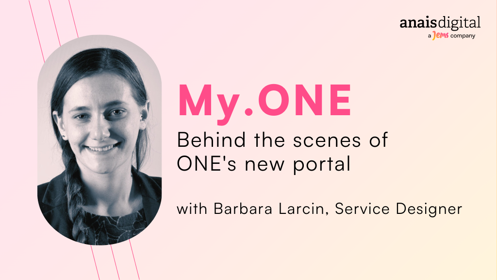
My name is Barbara Larcin. I’m a Service Designer at Anais Digital.
What is your role as a service designer?
Service design is about animating and facilitating a project’s ecosystem, so that each stakeholder can participate and derive added value from it.
In concrete terms, we run workshops with stakeholders. In the case of the My.ONE project, these are the project teams of designers and developers, but above all ONE’s stakeholders. We have different departments around the table, with the directors and their teams.
Can you tell us about the project Anais has just launched with ONE?
The project is called My.ONE. It’s a redesign of the current portal, which was called “Premiers Pas”, a site that allowed parents to search for a future childcare environment (a crèche or a nanny) to look after their little one. “Premiers Pas” is a project created by Anais Digital in 2019. Here we are on V2 and we’re delighted that ONE has trusted us to evolve the product. It’s quite rare for an agency to redesign a site it has created.
The aim of the redesign is to open up the portal to other places that provide support for parents and children. The new My.ONE portal will continue to offer a search for crèches and childminders, but will also enable parents to search for other places and resources.
With My.ONE, parents can also find ONE medical consultations for parents and children aged zero to six. In addition, there’s a whole portal on what we call ‘Accueil Temps Libre’. This is aimed at older children, who can go to homework schools for tutoring, access to activities on living together and all kinds of vacation activities.
What was the objective of the redesign?
The aim was to centralize information on a single site, enabling parents to find the right places, whether in the health sector, in early childhood or in leisure time, to accompany their child.
How did you approach the challenge of centralizing information?
This is where the contribution of a service designer was essential. We had different departments that weren’t used to working together. We got them to sit around the table and make joint decisions to create a portal that would best meet parents’ expectations.
What methodologies are used in this project?
At Anais, in the UX world, the approach we try to use is the famous design thinking approach. The aim of design thinking is to say to ourselves that we’re going to have parts where we’re going to explore. We’ll look for solutions through interviews and co-creation workshops, and then there’s a part where we’ll really try to select the best thing to implement. After that, we try to get the machine up and running by supporting the project teams, designers and developers to get the product into shape.
What was the most exciting part of the project?
We’re on a platform aimed at the general public, so we’re on a project with a large audience. It’s a project that will enable parents to see ONE in a new light. For us, that was the exciting part.
Today, parents know ONE mainly for the logo they see on crèches, but they don’t really know what’s behind it.
With this new site, we wanted to show that ONE is a true partner for parents. It helps them at every stage of parenthood, from infancy to the child’s eighteenth birthday.
This portal is the first product that clearly visualizes this for parents. It’s a site with a lot of information, but it’s also interactive, with a map where you can find a concrete place where your child could be welcomed.
What were the project’s challenges?
The challenge was to see how we could split up the project. When you’re talking about a cross-functional portal with departments that have never spoken to each other before, a million great ideas come to mind. The task, which is ongoing, is to know how to phase these different stages, these new improvements, these new functionalities so that everyone is happy.
How do you facilitate this dialogue between departments that aren’t used to working together?
One posture we use in this type of project is the facilitator’s posture. We’re going to organize a series of meetings that turn into workshops, co-creation workshops.
When we say co-creation, we often think of brainstorming to come up with new ideas. Here, we’ll also be holding co-creation workshops to think through strategy and milestones, and to see which decision points we want to take on board with us.
How would you like a parent arriving on the site to feel?
We’d like to make it easy for users to understand how the site works. Unlike ONE.be, My.ONE isn’t an information site, so we won’t be proposing categories of information to the user.
We’ll ask them to enter their address and search for places around them on a map. It works a bit like an Airbnb, a Google map or any other map system that lets you find places around you. But since we’ve designed it our way, we hope the parent will be able to use it.
Read our case study to learn more


