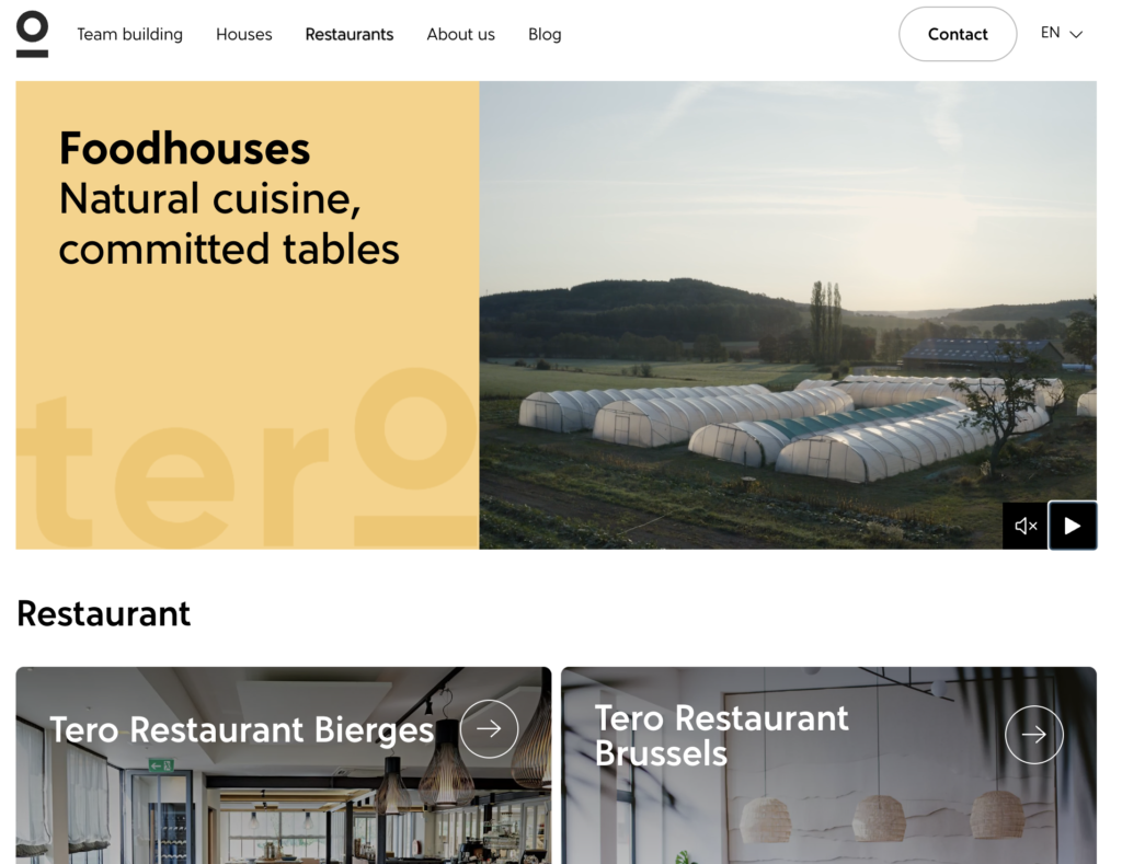
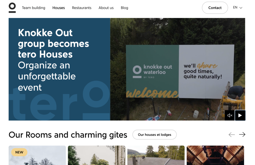
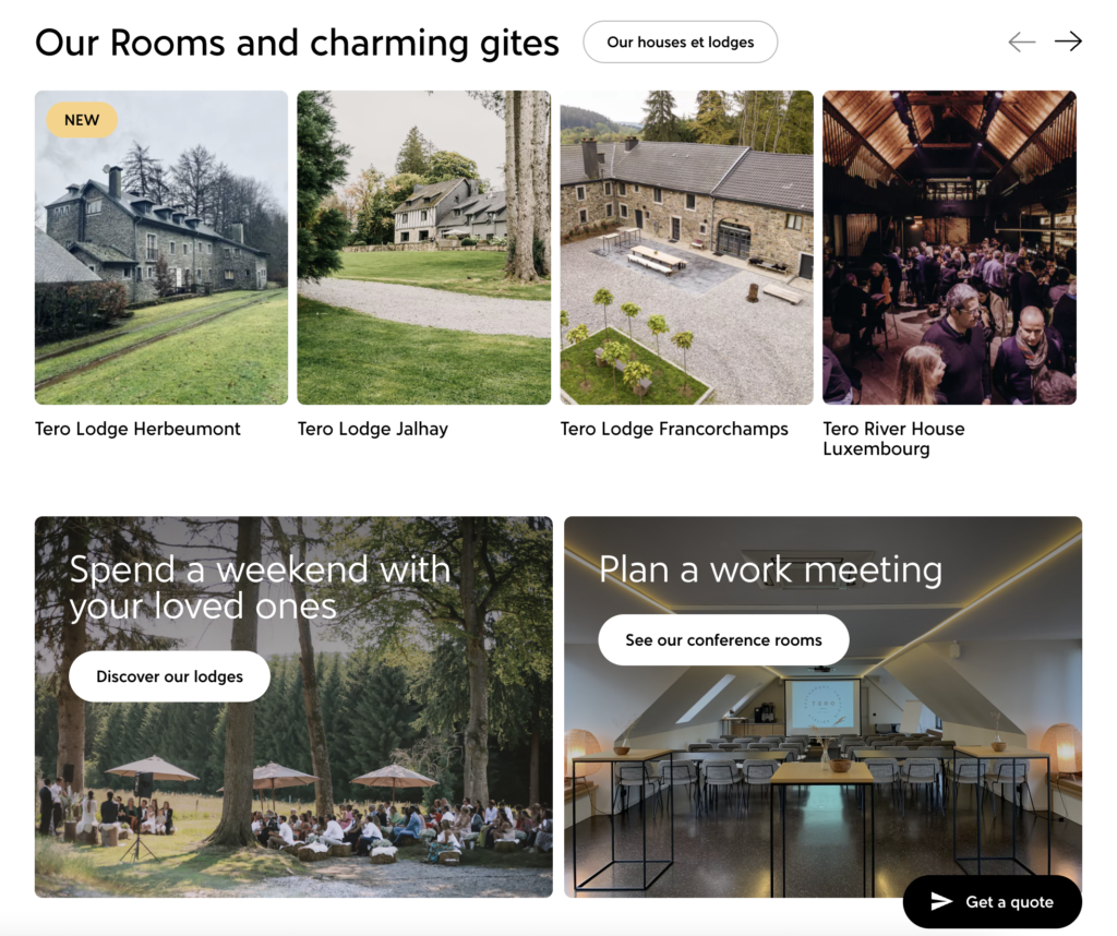
Tero : a single website combining the Lhoist brothers’ global vision
The 2022 merger between the Lhoist brothers’ companies – People First and Knokke Out – led to the creation of Tero, a new company that perfectly combines Arthur and Nicolas Lhoist’ businesses and vision.

The challenge
Tero has a global vision and aims to receive a B Corp certification. An engaged company, committed to local sourcing and sustainable renovation, Tero’s choices are based on its ethical charter.
It was therefore important to translate the positioning and values of the company into the design of the site.
3 objectives
Stick to the existing visual identity:
Create a global experience for users while keeping Tero’s identity. Stay consistent despite the different targets and activities of the company’s 3 divisions: Team Building, Houses and Restaurants.
Simplify the functionalities:
Improve quote requests by better qualifying them ahead of time in order to facilitate the work of the Houses and Team Building sales teams.
Facilitate information processing:
Respond to customers’ needs in the best manner possible. Add filters to allow users to quickly find what they are looking for.

Our approach
Our starting point: addressing the overall architecture of the site.
We then applied our lean startup methodology and created the first section: “team building”.
We quickly tested and validated this before focusing on the other two sections.
Main steps of the design process:
- User flow
- Mock-up
- Design and prototyping
- Test period
- Design iteration
- Development
We built the site on WordPress and worked with experts to develop the content and SEO.
We then added the French language content to the site.
Finally, we closely followed the evolution of the site and tracked the data with Google Analytics.
The site officially launched on September 8, 2022.

The results
The site successfully combines Tero’s three different divisions and communicates the company’s vision and values through a coherent, engaging and comprehensive site.
Florence Casonato, Project Manager :
Florence Casonato, the Tero website’s project manager and UX researcher, shared her thoughts on the project:
What has been the most memorable part of the Tero project for you?
Participating in the evolution of this company which has a true environmentally-responsible vision.
What was the most challenging part?
The biggest challenge was balancing the needs of the users, the client’s requests, technical feasibility and design, in order to integrate everything into the new site. We managed to come up with a result that made everyone happy.
Have a website project?
Work with a quality web agency! Let’s meet in our offices in Brussels, Belgium, or virtually.